A Semiotic Analysis of L’ORÉAL Advertisement: This is an Ad for Men Campaign
on
https://ojs.unud.ac.id/index.php/linguistika/
DOI: https://doi.org/10.24843/ling.2021.v28.i02.p05
LINGUISTIKA, SEPTEMBER 2021
p-ISSN: 0854-9613 e-ISSN: 2656-6419
Vol. 28 No.2
A Semiotic Analysis of L’ORÉAL Advertisement: This is an Ad for Men Campaign
Ni Made Ariani
Denpasar
Abstract - This study aims to analyze the message in an advertisement by applying the theory of semiotics. The data source in this study is one of the advertisements from L'Oreal’s campaign, entitled “This is an Ad for Men Campaign.” The theory utilized as a reference in the analysis process is the semiotic theory proposed by Chandler (2017) by paying attention to the two forms of signs contained in the advertisement, namely verbal sign and visual sign. The data collection method in this study is a combination of the observation method with the note taking technique. While the qualitative method is applied in the process of analyzing the data proposed by Creswell (2009). In presenting the results of the analysis, this study combines formal method in the form of using tables and photo as well as informal methods in the form of descriptions. The conclusion of this study is that this advertisement does not only promote their products for commercial purposes only, but this advertisement is also able to raise social issues experienced by women both in their personal lives and in their professional careers. This advertisement combines the power of verbal sign and visual sign in conveying their message to a wide range of audiences. Three verbal signs and three visual signs are combined to obtain the audiences’ attention in understanding the message of this advertisement.
Keywords: Semiotics, Verbal Signs, Visual Signs, Advertisement.
Abstrak - Penelitian ini bertujuan untuk menganalisis pesan pada iklan dengan menerapkan teori Semiotika. Sumber data pada penelitian ini adalah salah satu iklan dari kampanye L’Oréal yang bertajuk “This is an Ad for Men Campaign.” Teori yang dipergunakan sebagai acuan dalam proses analisis adalah teori Semiotika yang dikemukakan oleh Chandler (2017) dengan memperhatikan dua bentuk tanda yang terdapat pada iklan tersebut, yakni tanda verbal dan tanda visual. Metode pengumpulan data pada penelitian ini adalah metode simak yang dikombinasikan dengan teknik catat. Sedangkan metode kualitatif diterapkan dalam proses menganalisis data yang dikemukakan oleh Creswell (2009). Dalam menyajikan hasil dari analisis, penelitian ini mengkombinasikan metode formal berupa penggunaan tabel dan foto serta metode informal dalam bentuk deskripsi atau penjelasan. Kesimpulan dari penelitian ini adalah iklan ini tidak hanya mempromosikan produk mereka dengan tujuan komersial semata, namun iklan ini juga mampu mengangkat isu-isu sosial yang dialami oleh kaum perempuan baik dalam kehidupan pribadi maupun dalam karier profesional mereka. Iklan ini mengkombinasikan peran dari tanda verbal beserta tanda visual dalam menyampaikan pesan terhadap khalayak luas. Tiga tanda verbal dan tiga tanda visual dikombinasikan untuk menarik perhatian pembaca dalam memahami pesan dari iklan ini.
Kata Kunci: Semiotika, Tanda Verbal, Tanda Visual, Iklan
Vol. 28 No.2
-
1. Introduction
Advertisement has been one of the most powerful communication tools in the society. It commands information, persuasion, and encouragement for promotional purposes and good causes. Dyer (1982:2) simply defines the word ‘advertising’ as the action of drawing attention to something or notifying or informing somebody of something. Advertisement serves to reach many different layers of audiences and get varied types of information across worldwide. One of the unique phenomena about the advertisement is the rendition of the intended information. An advertisement can precisely detail the information for the audiences to understand the intended message and to leave no room for misunderstanding; meanwhile some other advertisements opt for the absolute opposite option by concealing the intended information to generate more curiosity and more attention from the audiences. These two options of outpouring and concealing the information will eventually come to a similar goal of drawing audiences’ attention. There are two important components about an advertisement, the verbal and the visual signs. Linguistically, the verbal sign can be intricate. Different natures, target audiences and purposes of the advertisements influence the language use. Moreover, the vibrant of the visualization varies adapting to the creative concept to provide more space for the audiences to perceive the messages. Therefore, the verbal and visual signs of the advertisements work together in a combination to play a major role in conveying the message, attracting the audiences and shaping the way they interpret or investigate the concealed messages. The goal of this research is to analyze the concealed or the intended message of L’Oréal advertisement. The uniqueness about this
advertisement is the way it positions females, rules they have and how they are portrayed in the society. This advertisement does not merely bombard its targeted audiences with trivial promotions to make a purchase of the beauty brands this company has to offer, but this advertisement provides a deep opportunity for the audiences to analyze deeper the messages behind of its campaign. The intricacy of the verbal and visual signs of this advertisement and how they connect together in creating a message is worth analyzing linguistically.
As this research deals with two different signs, verbal and visual signs, a semiotic approach is utilized in conducting the analysis to better understand how these two signs contribute in rendering the message. Chandler (2017:1-2) explains the shortest definition of Semiotics is as the study of signs. He further describes that all meaningful phenomena, which includes words and images are signs. His explanation regarding the nature of the Semiotics can be learnt from this quotation provided below.
“To interpret something is to treat it as a sign. All experience is mediated by signs, and communication depends on them. Semioticians study how meanings are made and how reality is represented (and indeed constructed) through signs and sign systems.”
The above quotation highlights the importance of Semiotics to discover the densely layered meaning epitomized by a particular sign. Zakia & Nadin (1987:6) further explains that by discovering the message of the advertisement, we will also be able to discover the way in which words and pictures work together to reinforce the message and how these two components utilize gesture, art,
Vol. 28 No.2
myth, and symbol to give emotional impact. In order to have a deeper understanding about how Semiotics can be used to analyze an advertisement, three research are therefore taken as the literature reviews for this research. Ranjan (2010) considers the present advertising not only as an occasional conduit of product information but also as an omnipresent communication arena in which making the human perception creative and ambitious. Meanwhile, the second work by Hassan (2015) describes that different semiotic modes can be juxtaposed in meaning making process. She further emphasizes that culture is part of social semiotic resources that is used as a tool for meaning making in analyzing tourism advertisements. Last but not least, the third work by Rhoades & Irani (2008) investigates various messages behind an agricultural company’s advertisement on how they convey the cultures of rural life to farm and non-farm audiences. They further suggest that semiological analysis offers a unique opportunity for researchers to analyze such images and determine the messages that these researchers portray. These three research demonstrate the fact that Semiotics facilitates audiences to interpret different signs and provides a solid structure to understand the functions that signs have to render a particular meaning with an intended aim.
-
2. Material and Method
Qualitative description approach is applied to describe the qualitative analysis of this research. This approach is to describe the messages conveyed by both verbal and visual signs of this advertisement. Moreover, the description also details the phenomena encountered by females in the society, which is the core issue of this advertisement. The type of data for this research is
the primary or qualitative data, which includes both verbal and visual signs appear on the L’Oréal advertisement for its “This is an Ad for Men” campaign. An image of this advertisement is sourced from an online website (https://www.adsoftheworld.com).
This advertisement is chosen to be the data source of this research based on the unique way this advertisement possesses in addressing varied issues females encounter in their daily basis and how they are portrayed in the society. As one of the leading beauty brands in the world, this L’Oréal advertisement does not only celebrate the glamour side of females but also the strength and the empowerment they deserve to fight for. Furthermore, the non-interactive method is applied in collecting the data by combining the reading and note-taking techniques.
Meanwhile the qualitative method by Creswell (2009:173-202) is applied in analyzing the data. The analysis is initiated by identifying all of the signs conveyed by the advertisement. Secondly, each of collected sign is classified into two different categories, which are the verbal and the visual category. The third technique in analyzing the data is to investigate the relationship each of the sign possesses in reflecting the power and position females have in the society. Moreover, this research combines the formal and informal method in presenting the results of the analysis. A number of photos, which are parts of the advertisement along with tables, are the application of the formal method. Meanwhile, the description detailing the logical analysis and the information conveyed by each sign in the advertisement is the application of the informal method. The theory of Semiotics by Chandler (2017) serves as the main theory utilized in this research. Meanwhile a number of other references
Vol. 28 No.2
on advertising are also taken as the additional references to enrich the understanding about the nature of the advertisement in general.
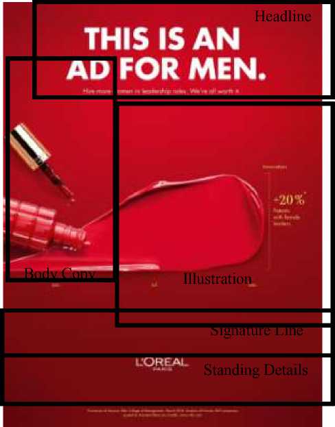
As the first finding of this study, five components are identified in the L’Oréal advertisement. Those five components are Headline, Illustration, Body Copy, Signature Line and Standing Details. Meanwhile, as the second finding of this study, it is found that this advertisement combines the verbal and the visual signs in campaigning the intended message to their addressable audiences.
Leech (1972) explains five components, which generally construct an advertisement, which include Headline, Illustration, Body Copy, Signature Line and Standing Details. These following details are those components identified in the L’Oréal advertisement.
the most creative way possible. It epitomizes the message and engages varied perceptions to view the advertisement. The illustration of this advertisement shows an opened nail polish pouring a red ruby paint completed with a brief information, which read “+20%t* Patents with female leaders.” This information is then followed by three small prints below the nail polish indicating three different months of January (Jan), July (Jul) and December (Dec). The red background and the yellow prints also pay an additional contribution in adding a bold impression to the illustration of this advertisement.
-
3.1.3. Body Copy
This component serves to provide the information about the actual product being advertised. It plays a vital role in ensuring the audiences understand about the product or services the brand has to offer and the nature of the company. The product in this advertisement is nail polish, which appears at the left side of the space.
This component serves as the initial strategy in attracting audiences’ attention. It provides a clue or two about the brand being advertised. “This is an Ad for Men” is the first or the primary headline; meanwhile “Hire more women in leadership roles. We’re all worth it” is the second or the supporting headline. These two headlines in white print appear at the very top of the advertisement to potentially seize audiences’ attention immediately.
This component serves to provide an opportunity for the audiences to interpret the message an advertisement attempts to convey in
Vol. 28 No.2
Figure 3.1
Components of L’Oréal’s Advertisement 3.1.4. Signature Line
This component serves to show the signature of the brand and the identity of the company. The name of the company “L’Oréal” followed by the word “Paris” appear to be the well-celebrated signature line from this advertisement.
This component serves in providing an additional information which supports the advertisement. The additional information may include the company’s physical address or headquarter, contact information, specific instruction about the advertised product or the additional information to add or clarify a particular part addressed in the advertisement, which are intentionally implied or concealed. The small yellow prints at the bottom of the advertisement, which read “*University of Arizona, Eller College of Management, March 2018. Analysis of Fortune 500 companies, quoted by Assistant Dean Joe Carella” followed by the official website link “www.cnbc.com” can be identified as the Standing Details of this advertisement.
It is an art in selecting the appropriate wording arrangement for conveying a particular message in an advertisement. Some leading advertising agencies opt for more of a conventional wording arrangement by detailing the entire information and put them all in the advertisement unconcealed.
This option may want to anticipate any misunderstanding or misperception from audiences
to perceive the actual message the advertisement attempts to render. On the other hand, some other agencies may apply an extreme creative innovation in concealing the message of the advertisement to stimulate audiences’ curiosity on the very first place. They may keep the wording arrangement as minimum to provide more space for audiences to develop their own interpretations and process the intended message. This innovative technique is expected to generate more interaction among audiences, specifically the prospective customers. Buidling a solid association between the brand and the audiences is a vital importance to attract their attention, spark their interest, and obtain their loyalty. One of the most effective ways in building this association is through the advertisement’s wording arrangement. Turner (in Dyer, 1982:32) explains the significance of building the association with audiences as quoted below.
“An advertisement should be presented in such a way that a reader would associate it with his own experience, which was best done by appealing to his ruling interests and motives. These included the desire to be healthy, to possess, to wear smart clothes, to get something for nothing, to be more like the privileged and successful classes.”
An effective wording arrangement is capable of addressing the above interests and motives audiences have. The ability to be fully aware about issues and specific things, which are being demanded by the society determines the effectiveness of an advertisement in reaching out their addressable audiences.
Therefore, investigating whether this L’Oréal advertisement effectively addresses the issues emerge in the society is essential to do by
Vol. 28 No.2
analyzing its verbal signs. There are three sentences categorized as the verbal sign of this advertisement as presented below.
No Verbal Signs of L’Oréal Advertisement
-
1 This is an Ad for Men.
-
2 Hire More Women in Leadership Roles.
-
3 We’re All Worth it.
-
Figure 3.2 Verbal Signs of L’Oréal Advertisement
“This is an Ad for Men” can be identified as one of the bold ‘moves’ from this advertisement. This advertisement advertises a nail polish. The image used is an opened nail polish with its paint pouring down showing a red ruby color, which is commonly associated with the idea of femininity or the favorite color choice of females. However, the headline boldly informs the audiences that this advertisement is actually for men. One of the interpretations is that this advertisement may want to have men look at this since there must be an information intended for them. The advertisement may specifically target males for this campaign, even though the product being advertised is commonly used by females. This wording arrangement possesses a strategic value in stimulating audiences’ curiosity to learn the actual reason on why males have to be looking at this advertisement and what a nail polish has to do with them.
Some audiences may not be able to help and wonder why the word “Men” is chosen instead of “Women.” Moreover, some others may immediately judge that there is no connection between the product and the headline. When the curiosity is there, it means an initial success for the advertisement to attract audiences’ attention. Likewise, when there are varied perceptions
emerge, it means another success for the advertisement to build the interaction among audiences. Finally yet importantly, when there is even a ‘confusion’ caused by an advertisement, it means a success for the advertisement to reach out a wide group of audiences with different backgrounds. Audiences may spare a few minutes to have a second look and briefly scan the entire advertisement as a quick attempt to find out the answer and fulfill their curiosity. Obtaining audiences’ attention is the first goal of the advertisement. In spite of having no plan to purchase of a nail polish or everything, which is advertised, but when an audience is willing to give their attention, it is an absolute ‘win’ for the advertisement. A curious or even confused audience will likely talk about this question they have with other people. These other people will potentially be curious to have a look at the advertisement by themselves and correlate the information they have heard toward the actual information they are about to see. This process is another form of getting the message across.
Therefore, the curiosity, confusion and varied perceptions stimulated by an advertisement are those qualities to assess how powerful and innovative an advertisement can be in attracting their audiences and encourage them to keep on sharing this advertisement to even larger scope of the audience. The unique quality of the advertisement plays a strategic marketing tool to not only show how the advertisement presents the products, but also to embody creative signs to communicate with their audiences. The communication process can start simply by passing a piece of information about the advertisement around family, friends and colleagues to sharing this information online using the social media platforms. “This is an Ad for Men” is a very
Vol. 28 No.2
creative wording arrangement and can be considered as a quick and instant attentiongrabbing strategy, which can easily attract and engage a wider audiences.
Unlike the first verbal sign, which conceals its intended message and instead allows the audiences to build their own interpretations, the second verbal sign explicitly reveals its message. This advertisement informs the audiences in general, males as specifically addressed through the first headline as well as the workforce industry to hire more women or females in leadership roles. This second headline campaigns the gender equality in the workplace. It unveils a number of issues that females encounter at work. Underestimation, lack of equality in opportunity, payment or wage gap, inequality in career promotion, discrimination, verbal and sexual harassment are those common issues among any others that females often times face. It has been depressing to learn that these issues are still happening in spite of the development of the globalized world nowadays. Females work tremendously and fulfill the same obligation as their male colleagues, however; the treatment they receive is ironically not equal. Females get paid less compared to their male colleagues is one problem, which commonly exists.
Unfortunately, at some professions, males tend to dominate in filling in the roles, not to mention the high positions they generally have. On the other hand, females are commonly stereotyped for only certain jobs that the others assume they can only be capable of doing. One realistic example addressing this issues is the expressions of “It’s a man thing” or “It’s a woman thing.” These
two expressions tend to limit what females can do and achieve in their professional lives. In fact, females seem to be restricted to develop their potential and improve their skill sets. In addition, there is also another form of discrimination happening in the workplace, when females are expected to appear with a particular look. Take, for instance, females who show up at work with their natural curly hair are assumed being less ready for work or unprofessional. Females who do not put on make-up are considered as not attractive and underestimated to be in charge of handling the public relation (PR) related duty. Last but not least, women of colors continue to experience racism. This second headline serves as a reminder that the workforce industry is still terribly unequal and urgent actions need to be taken to cope with the problems.
As one of the leading cosmetic and beauty companies worldwide, L’Oréal has been known for not only their extensive range of beauty products but also their famous slogan, which celebrates women and their ‘power.’ The slogan of “We’re all worth it” appears next to the second headline and resonates the sentiment that every woman or female is worth it. The diction of “Worth” generally conveys a meaning of measurement or particular level at which somebody or something deserves to be valued. This slogan obviously allows people to interpret the intended message and discover how meaningful it represents females in life. The beauty, courage, passion, respect, strength and vision every female possesses to fully live their lives are just to name a few qualities among many others, which need to be celebrated at all times and at all costs. A female’s worth is
Vol. 28 No.2
beyond measure. Different races, ethnicities, religions, political views and many other backgrounds every female possesses should never be an excuse to let them down or discriminate them in the society. Everyone has gone through a lot in their lives and no one should judge or underestimate each other. The slogan can be interpreted broadly and it brings the concept of equality on the table for everyone to notice and appreciate in their lives.
The concept of this equality can be identified from the word “We” and “All” in this slogan “We’re all worth it.” The slogan brilliantly addresses the issues every female encounters with the concept of equality, either in their personal or professional lives. The slogan does not merely remind how beautiful females are but also addresses many issues that they encounter in life and most importantly the slogan is capable of providing a sense of ‘comfort’ by acknowledging that we are all in this together and everyone can lift up each other for a better and beautiful life we all deserve to live. This powerful slogan can be one real example on how verbal sign is worth thousands of meaning. It does not only serve to persuade audiences to get to know the product being advertised and make a purchase to generate profit but it amplifies the philosophical value of the brand. A powerful verbal sign is not only capable of selling products but also introducing the brand’s identity by being aware of the issues happening in the society.
Visual signs render the message of an advertisement in the most vivid way possible. They speak volume in epitomizing the nature of the brand and the identity of the company. Moreover,
they often times are considered as the central focus of the entire advertisement in order to catch the audiences’ attention immediately. Visual signs are meticulously designed to amplify the message of the advertisement without outpouring any trivial or unnecessary information, which may create any redundancy. They are one of the components in an advertisement, which stimulate the initial engagement within the audiences to potentially convert them into the ‘paying customers’ toward the advertised product. Therefore, understanding the essence of the visual signs in an advertisement is a unique experience, which requires a well-rounded way of thinking. These are a number of visual signs identified from the L’Oréal advertisement as shown below.
No Visual Signs of L’Oréal Advertisement
-
1 Red Ruby Nail Polish
-
2 Red Background
-
3 Illustrated Chart
-
Figure 3.3 Visual Signs of L’Oréal Advertisement
The nail polish can be identified as the spotlight of the advertisement. Audiences will immediately attract to the opened nail polish pouring the red ruby paint. This illustration is placed at the center dominantly taking up the entire space of this advertisement. Nail polish has identically perceived as one of the means, which people can use to express themselves. Putting on our all-time favorite color of nail polish will serve as a sign, which instantly unveils a tiny bit of our character or personality trait. Other people can take a hint about someone’s character, mood, passion or even their perception in life through their color
Vol. 28 No.2
choices. No wonder putting on a nail polish is commonly viewed as an act of self-expression.
Introducing the latest shade of nail polish may not be the only intention of this advertisement, but it may also convey a message that females are free to express themselves. There was a stereotype when females are not recommended to put on red nail polish at work. The reason was simply that it might attract other colleague’s attention, which could potentially be a distraction and interfere work performance. This advertisement may want to remind audiences that females should be able to celebrate their freedom. One of the simple yet meaningful celebration is the freedom to express themselves through putting on a nail polish. Choosing a nail polish to be featured in this advertisement does not only highlight the product itself but also address the issue that females have long been faced with discouragement and limitation toward what they can be responsible for about their own selves and the principal space they deserve to have in their lives.
Moreover, the color of red ruby paint of this nail polish featured in this advertisement also conveys an important notion. Ruby itself has long been considered as one of the most beautiful, finest and beloved gemstones. These values simply resonate with the way females need to be portrayed. Females are loved not only because of their physical beauty, but it goes beyond their finest ‘quality’ in positioning and appreciating themselves in the society. In addition, ruby is a shade of red and pink. These color combination resonates a unique values, which reflect females’ character. The color of red has been associated with the values of love, strength, passion and power. Meanwhile the color of pink has been known reflecting a sense of femininity, compassion, playful and happiness. Therefore, the
decision in featuring a nail polish with the color choice of ruby may have an intention to portray how powerful, strong, passionate, and loving females can be. However, they will never give up their authenticity to remain being feminine, compassionate, playful and happy for being very true to themselves and appreciating their ‘worth.’ An opened nail polish pouring red ruby paint is an epitome and reminder that females should celebrate their freedom in expressing themselves, understanding, appreciating their ‘worth,’ and staying true to themselves while interacting in the society as an individual.
Another distinctive visual sign of this advertisement is the red background. The color of red can be identified as the bold color choice. As it has been addressed on part 3.3.1 that this color choice has been associated with the concept of love, strength, passion and power. One of the interpretations, which can be drawn is this advertisement may intent to show that females can be very powerful in life. They can be powerful in making every decision about their lives by using the love, strength and passion they have. This advertisement may also want to remind the audiences that females should not be continuously viewed as weak personalities. There have been many misperceptions about females in general caused by stereotypes in the society and this advertisement may attempt to remind audiences to support and lift up every females. The red background from this advertisement brings the sense of powerful energy as a form of support and encouragement for females to feel confident and brave to stand up for themselves and have their
Vol. 28 No.2
voices heard in their personal as well as in their professional working lives.
The red background may also attempt to remind audiences that females should be fearless in pursuing what they dream about in life. The ‘limitations’ they have been too familiar with should not have been one thing stopping them to be the very best version of themselves. The brave energy of this red background also signals the fact that females can have it all in life. There are so many narratives that once a female settles down and has children of their own, it automatically acts as a finish line for them to develop as an individual. This campaign on the contrary seems to urge audiences to think out of the box. Females have been struggling to juggle out their duties as an individual, a mother and a working-mother. Females can have it all and it is everything we all need to believe in and do. Another irony can also be identified from the existence of the terms “Working-Mother” or “Working-Mom.” Society seems to be fully aware of these two terms. People simply take these two terms without further questioning the logical reason in labeling a mother with an extra title in this case. However, the terms of “Working-Father” or “Working-Dad” does not seem to exist or be spoken about in everyday’s discussions. The scrutiny of how females in general, married ones or females with children position themselves in the society seems to be in a serious need of attention and understanding. As part of the society, who actually pay a contribution toward the society itself, females need to have their voices heard. The equality should not have been asked since everybody deserves to have it. It is not a question to ask, but it is a right to own.
-
3.3.3. Illustrated Chart
Another brilliant visualization from this advertisement is the chart showing the innovation in terms of patent female leaders successfully achieved. This chart is created by the red ruby nail polish being poured out, which indicates a significant improvement from January, July to December. This is another evidence that females deserve to have an equal opportunity to show their ability and what they can contribute. Ironically, some females tend to hold back on showing their ability, especially in male-dominated professions. Confidence is one of the primary keys every female should build and possess in order to make the equality itself happens. With all of the challenges that females encounter in their lives to fight for the equality, they need to always believe in themselves. Believing is the first step, which will stimulate them to work their ways up and discover that they actually can achieve everything in life. This illustrated chart cleverly shows a fact addressing the current issues by using the advertised product itself.
Moreover, the illustrated chart may also serve as an evidence that females have come a very long way to re-position themselves in the society. All of their accomplishments and efforts may not always have the acknowledgement they deserve to own from the very first place, but their willingness to keep up with the challenges or struggles to have a better life appears to be one thing in life, which needs to be appreciated. Perseverance seems to be growing organically among females, especially those who are not privileged enough to be handed down such an opportunity of equality in their lives.
4. Conclusions
It is concluded that the concealed or the intended message of this L’Oréal advertisement is females deserve the celebration for being the truest
Vol. 28 No.2
version of themselves. This advertisement combines the verbal and the visual signs to unveil the message. There are 3 verbal signs and also another 3 visual signs identified supporting each type of the sign to promote the advertised product, introduce the identity of the brand and to spread the message this advertisement attempts to convey. This advertisement does not only promote a commercial product of a nail polish, but it goes beyond of promoting common good about females’ struggle in fighting for an equality in their personal and professional lives.
Vol. 28 No.2
References
_________, This is an Ad for Men. Ads of the World. March 29, 2019.
https://www.adsoftheworld.com/media/print/loreal_this_is_an_ad_for_men_lipstick_mascara_nail_polish. Accessed March 16, 2021.
Chandler, Daniel. 2017. Semiotics: The Basics. London and New York: Routledge.
Creswell, John W. 2009. Research Design: Qualitative, Quantitative and Mixed Methods Approaches (Third Edition). California: SAGE Publications, Inc.
Dyer, Gillian. 1982. Advertising as Communication. London and New York: Routledge.
Hassan, Hanita. 2015. Social Semiotics: Realizing Destination Image by Means of Cultural Representations.
International Journal of Social Science and Humanity. Volume 5, No. 1.
Leech, G. 1972. English in Advertising: A Linguistic Study of Advertising in Great Britain. London: Longman Group Limited.
Ranjan, G.D. Dharmakeerthi Sri. 2010. Science of Semiotic Usage in Advertisements and Consumer's Perception. Journal of American Science. Volume 6, No. 2. New York: Marsland Press.
Rhoades, Emily B. & Irani, Tracy. 2008. The Stuff You Need out Here: A Semiotic Case Study Analysis of an Agricultural Company’s Advertisements. Journal of Applied Communications: Volume 92, No. 3. Kansas: New Prairie Press.
Zakia, Richard D. & Nadin, Mihai. 1987. “Semiotics, Advertising and Marketing” dalam jurnal The Journal of Consumer Marketing. Volume 4, No. 1. Bingley, United Kingdom: Emerald Publishing Limited.
166
Discussion and feedback